Brand Identity
Print Collateral
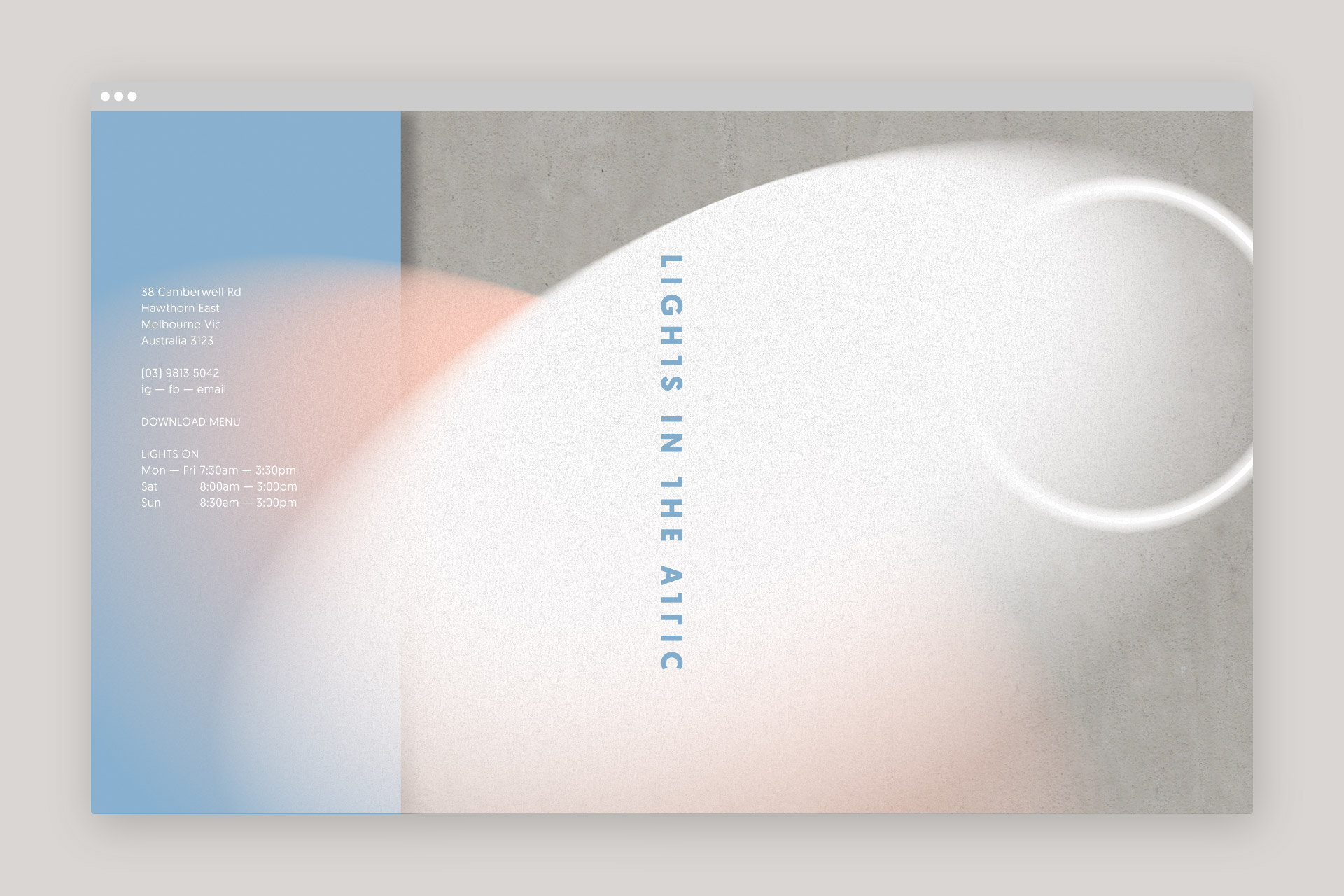
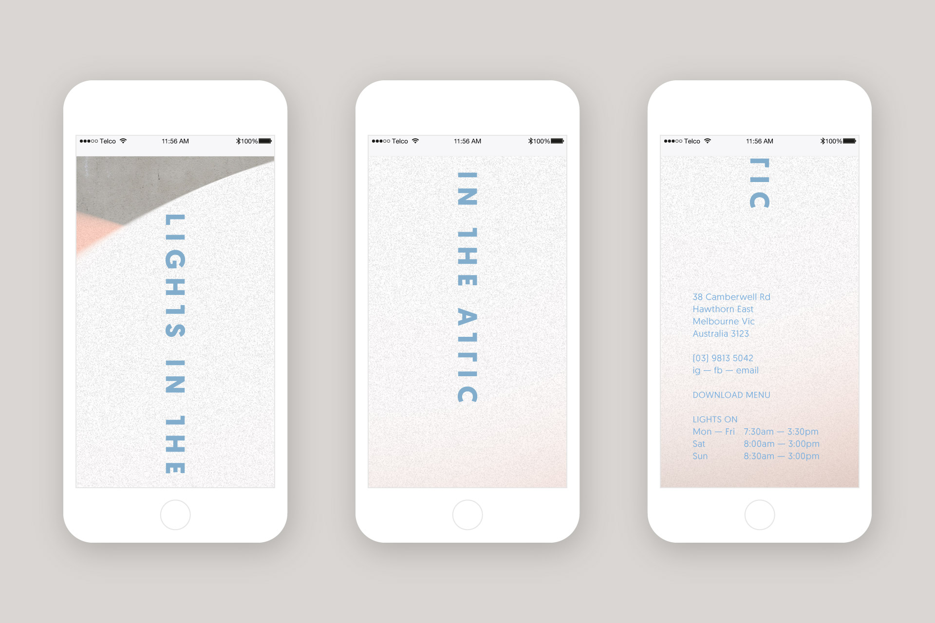
Website Design & Build
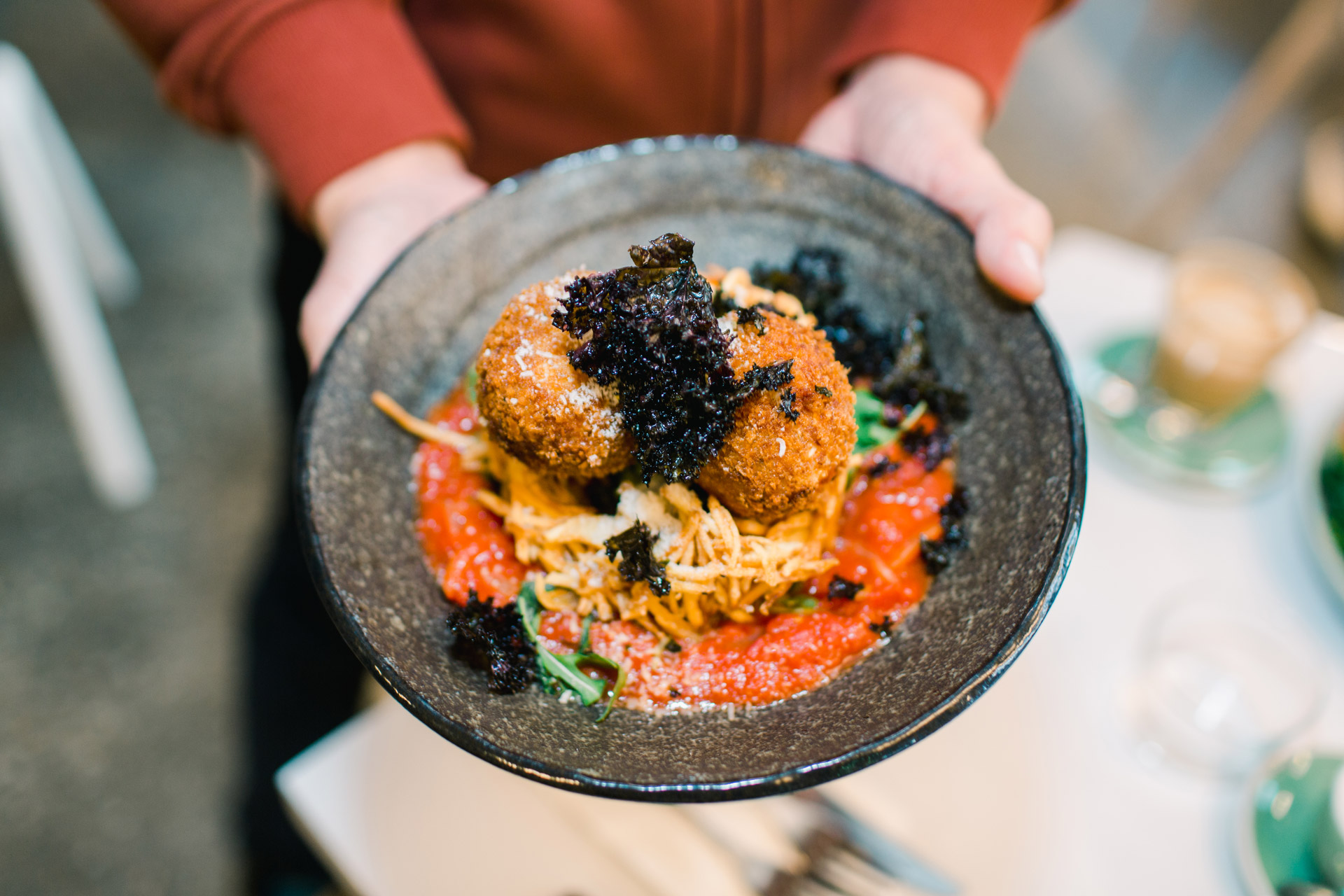
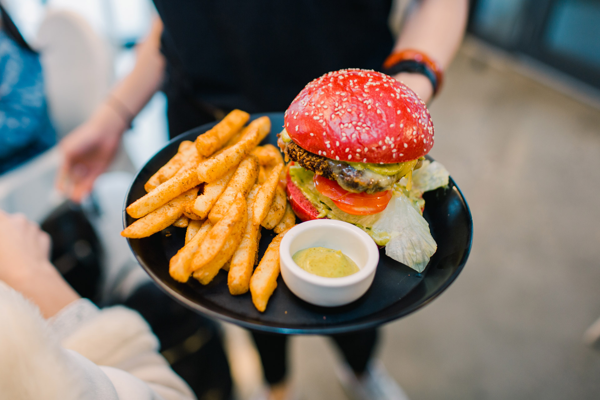
Food Styling & Photography
Signage
–
–
2017
–
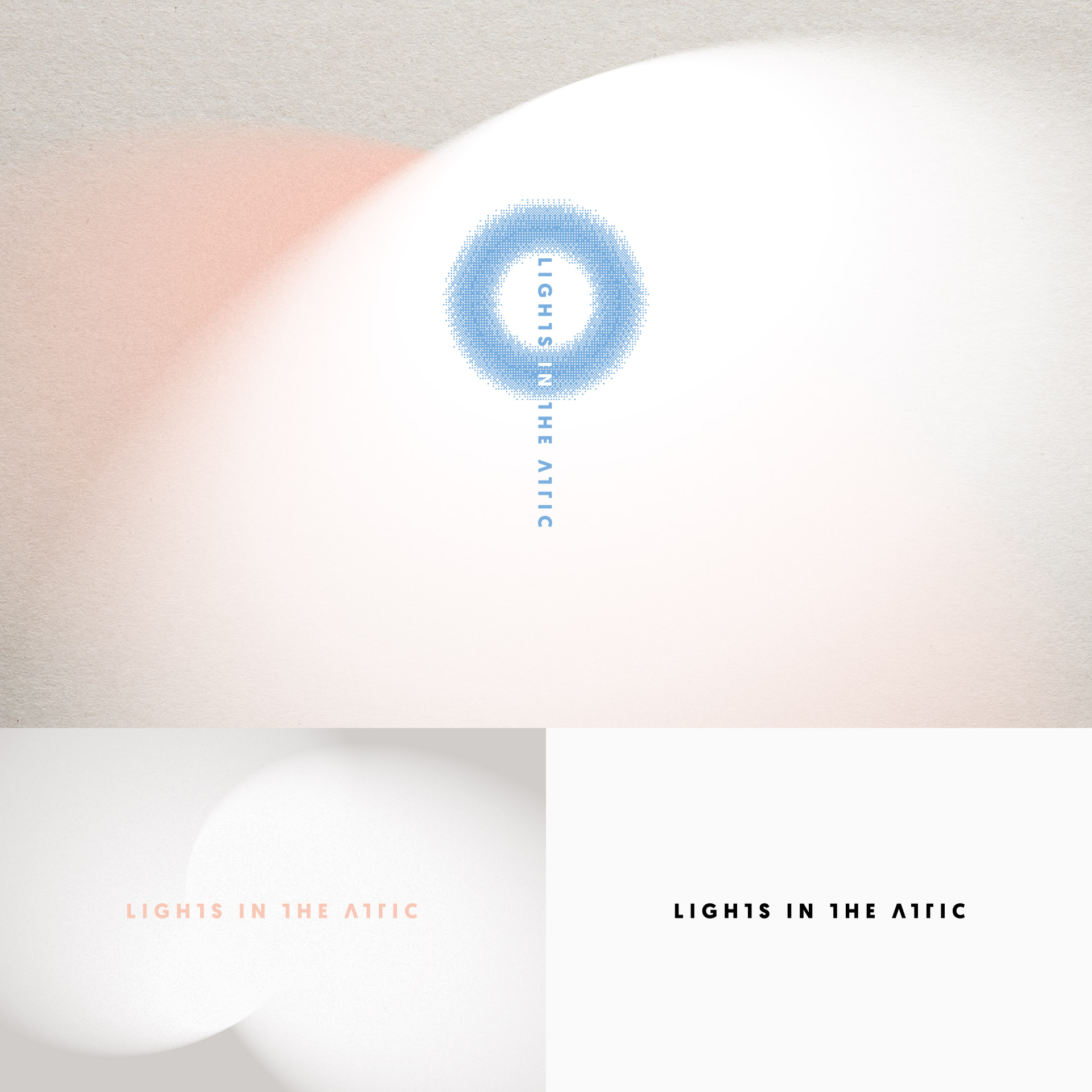
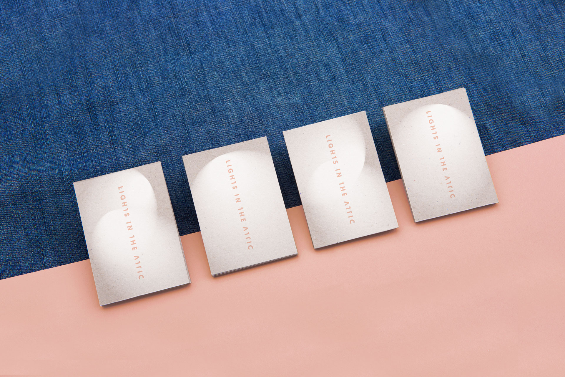
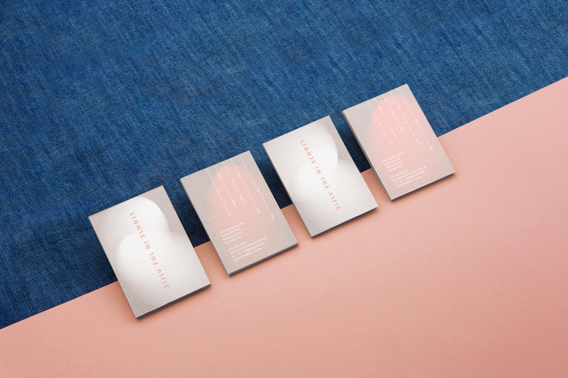
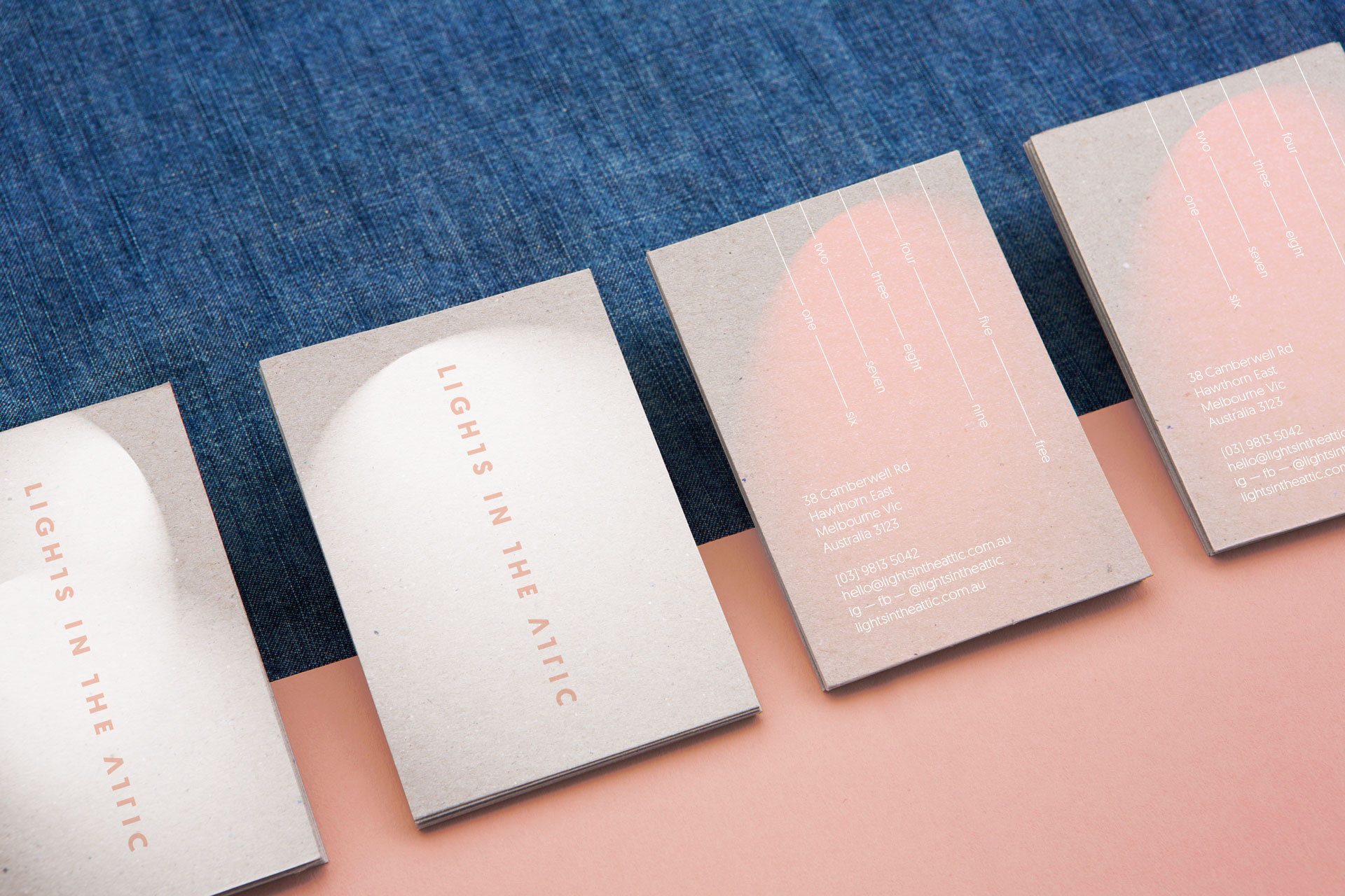
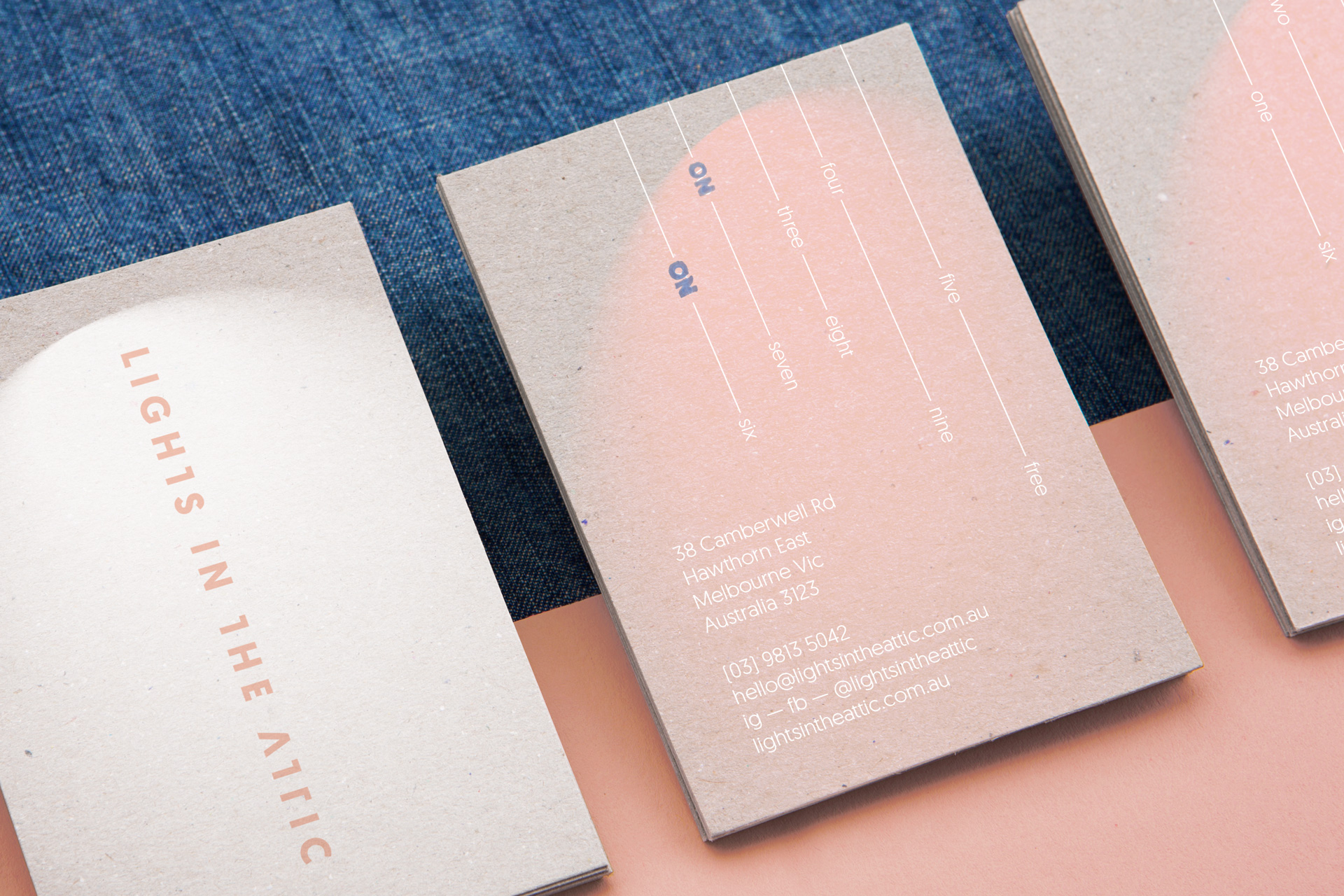
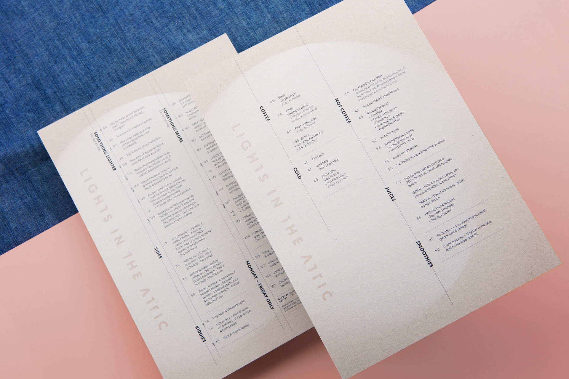
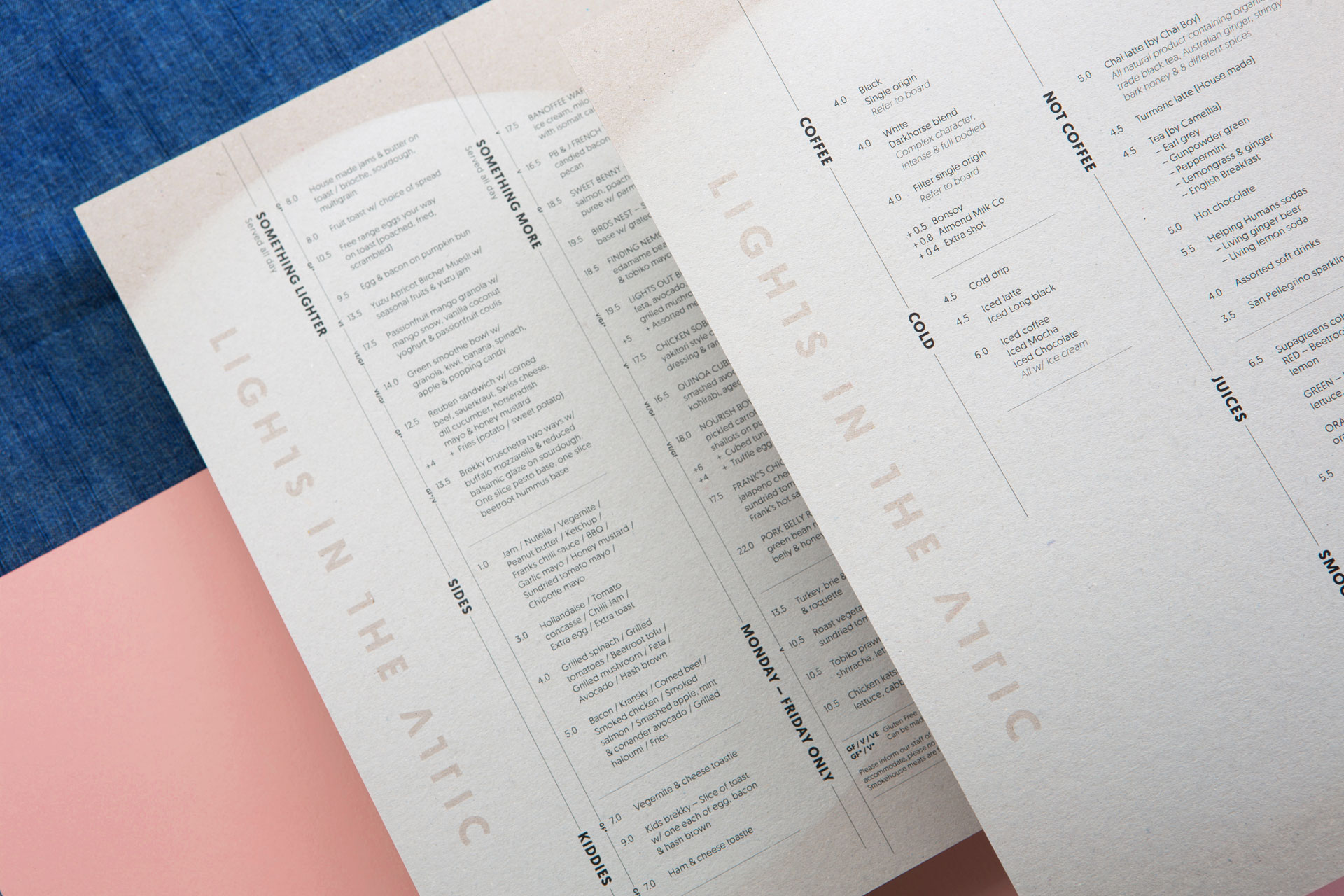
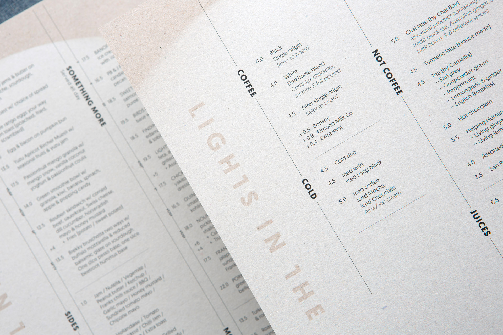
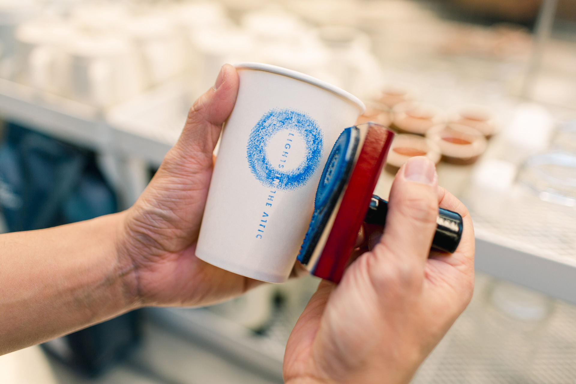
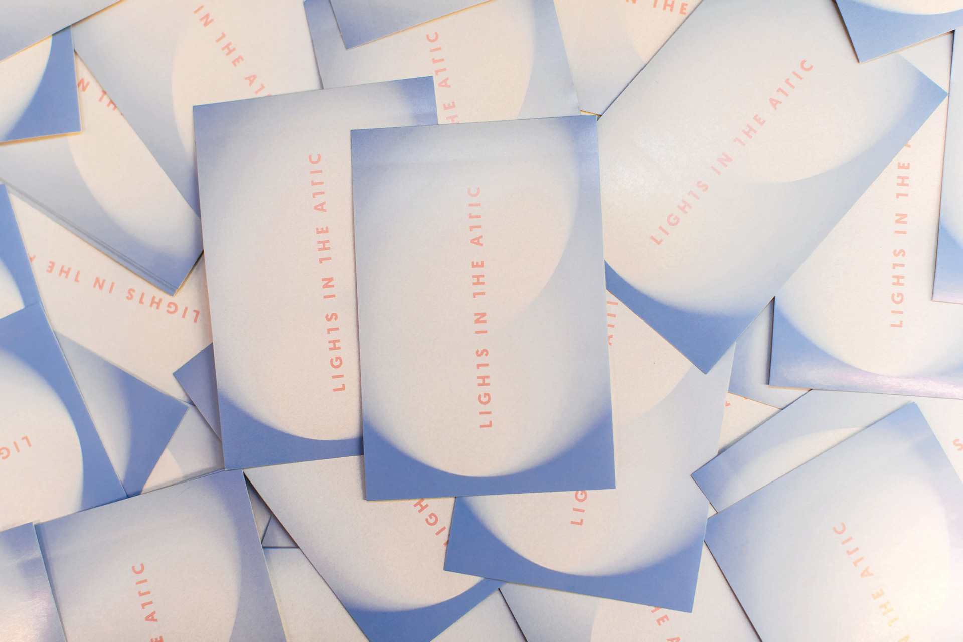
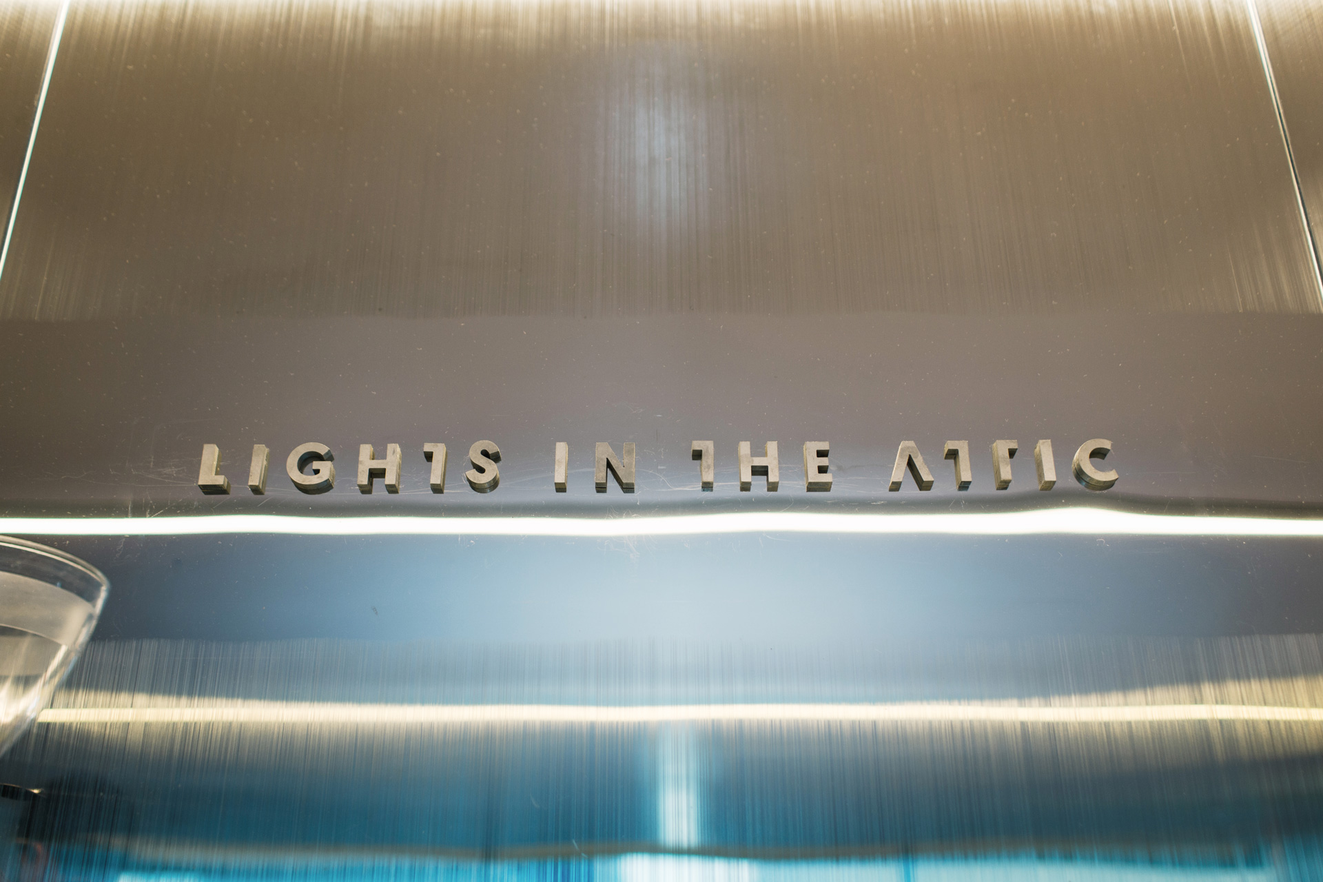
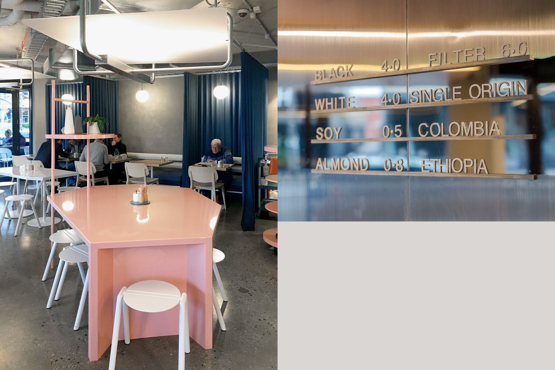
Lights in the Attic café branding is inspired by the name itself. With custom lettering, we created a logo type that is clean and simple yet unique. The whole nuance of the branding resembles lights that fall on wall surfaces. Lights in the Attic celebrates materiality in raw and finished form. From the interior designed by Architects Eat, raw steel bleeds to a mirror polish, a sandblasted wall is draped with denim and a polished ceiling draws the eye from an exposed concrete slab. We translated that philosophy to the stamping coffee cups and raw boxboard material that were used for menu and loyalty cards. Printed with opaque white for polished finish.
Lights in the Attic offers beyond your usual cafe experience.
Brand Identity
Print Collateral
Website Design & Build
Food Styling & Photography
Signage
–
–
2017
–